Nov 2026
DRIFT
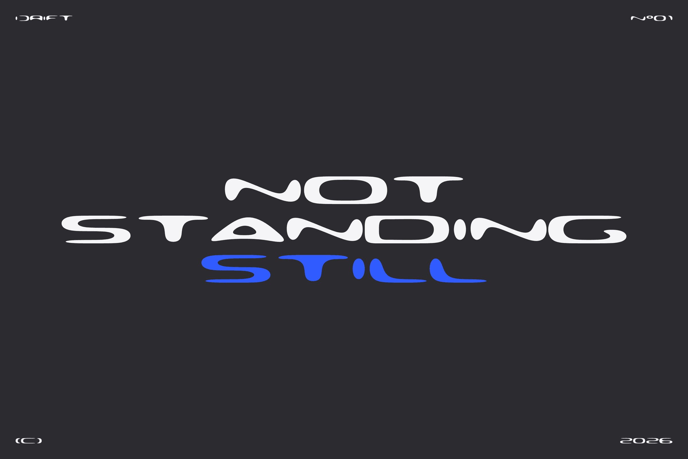
DRIFT — Built to drift. A brand typeface that never stands still.
The world my work lives in changes every year — new screens, new tools, new ways a brand has to show up. I wanted a typeface for my own brand that behaves the same way: a clear system underneath, and the freedom to bend when the context changes.
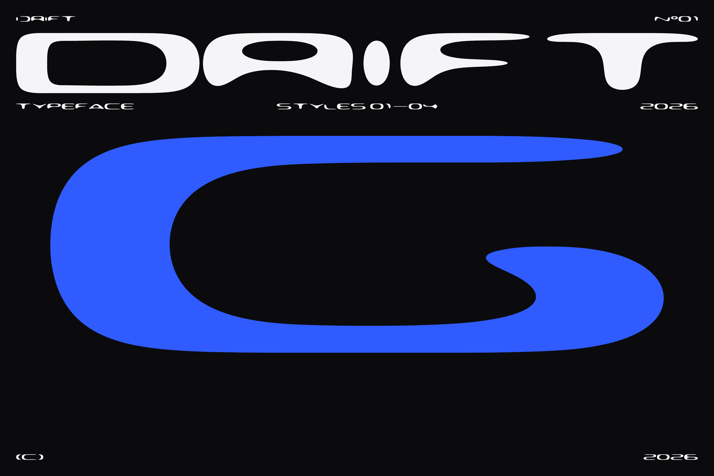
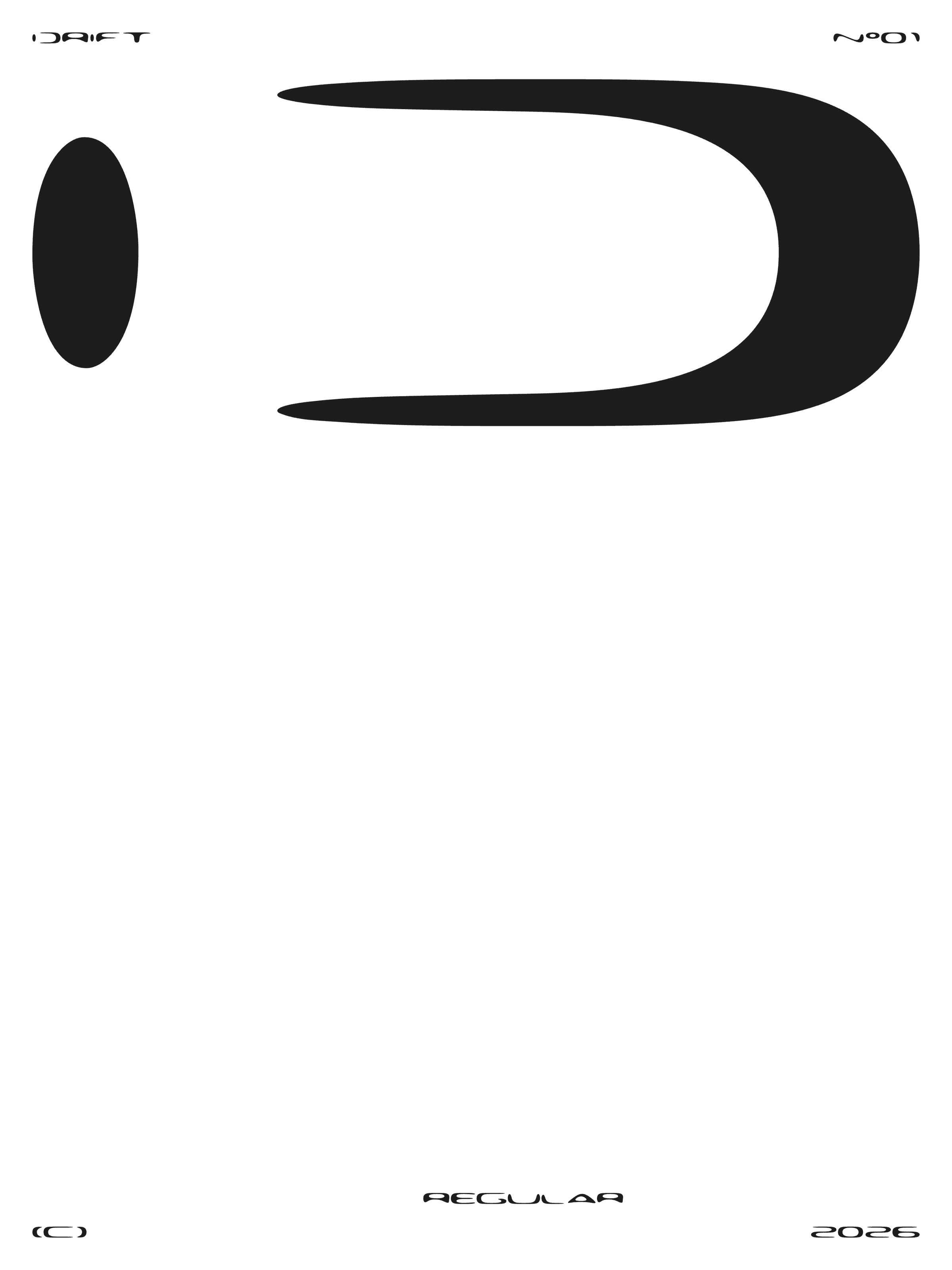
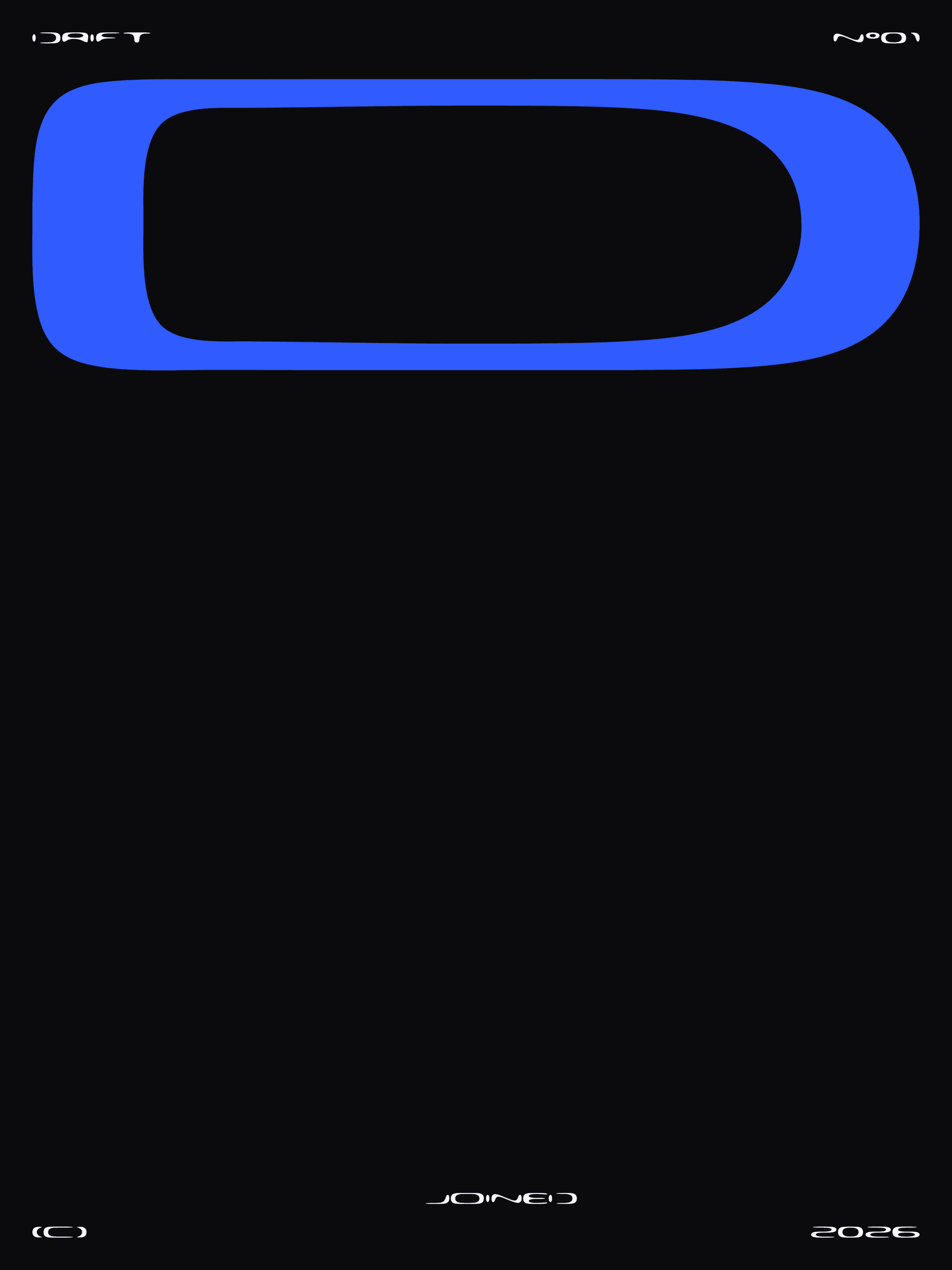
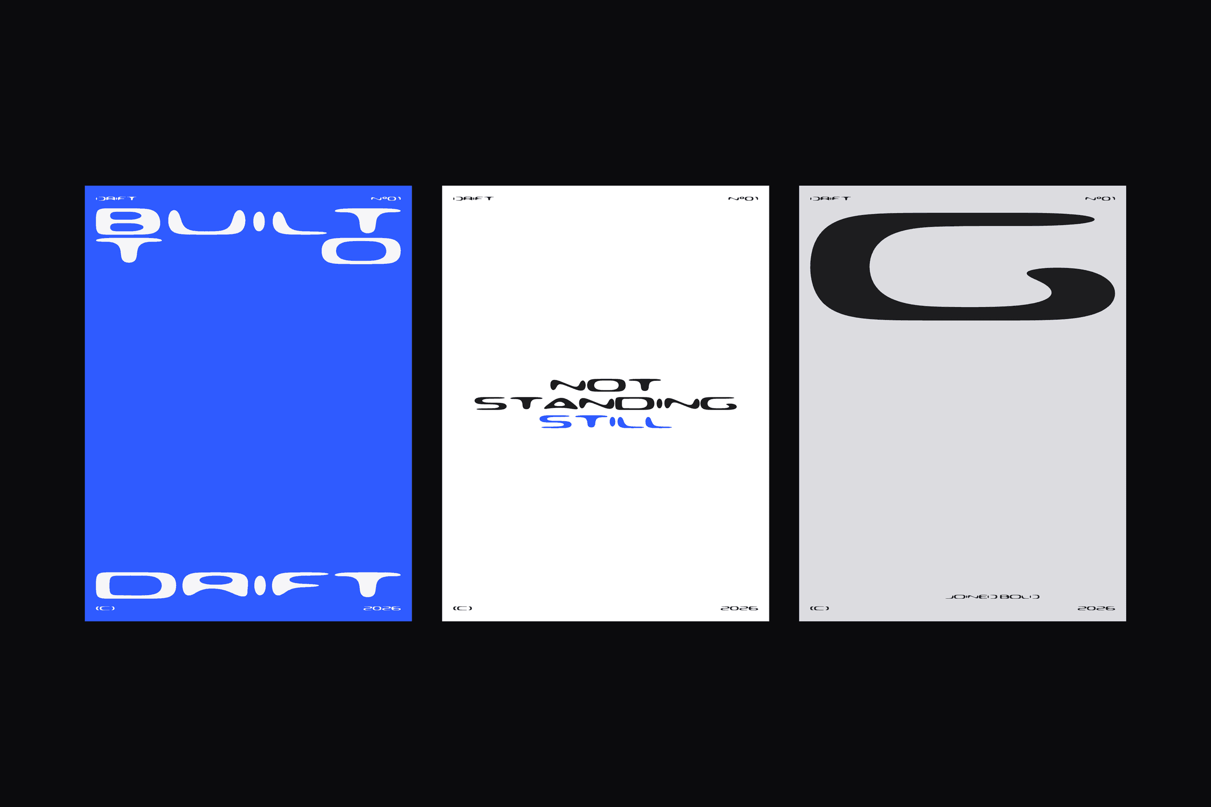
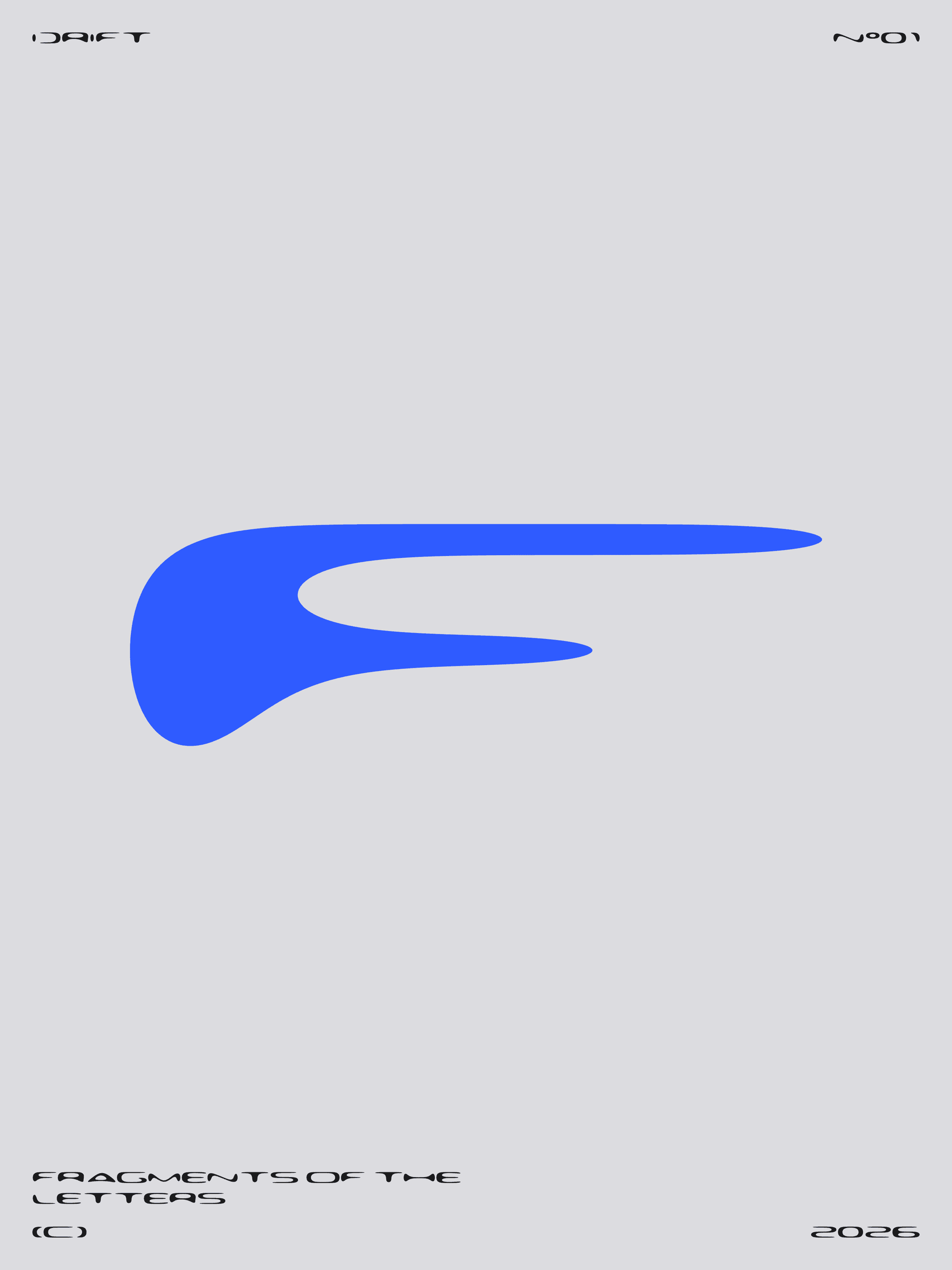
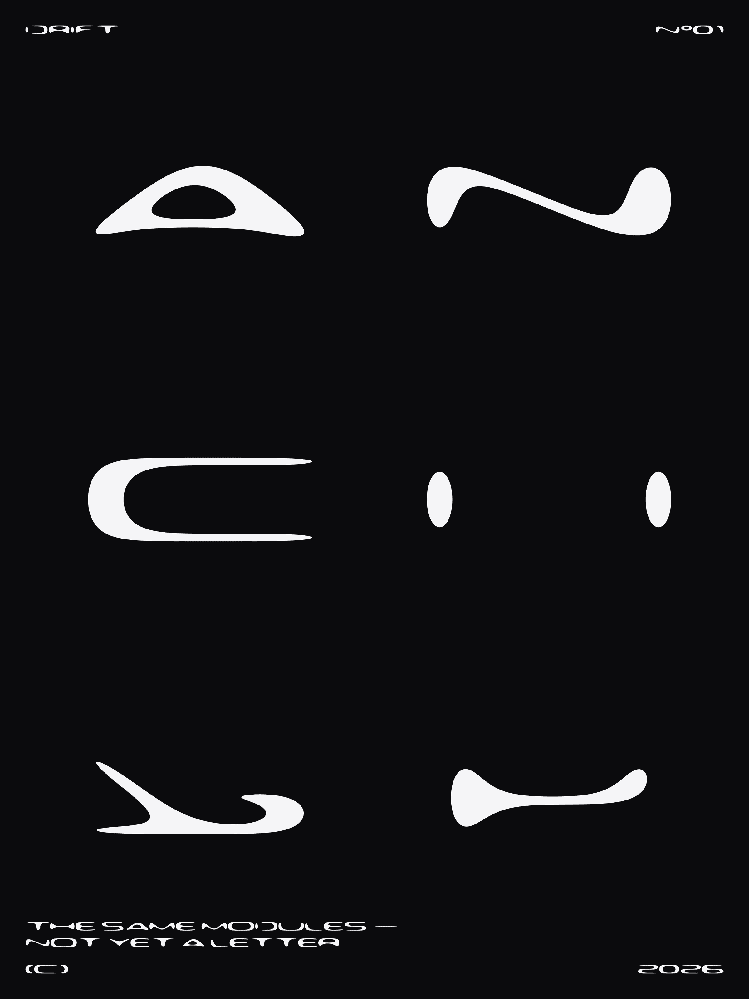
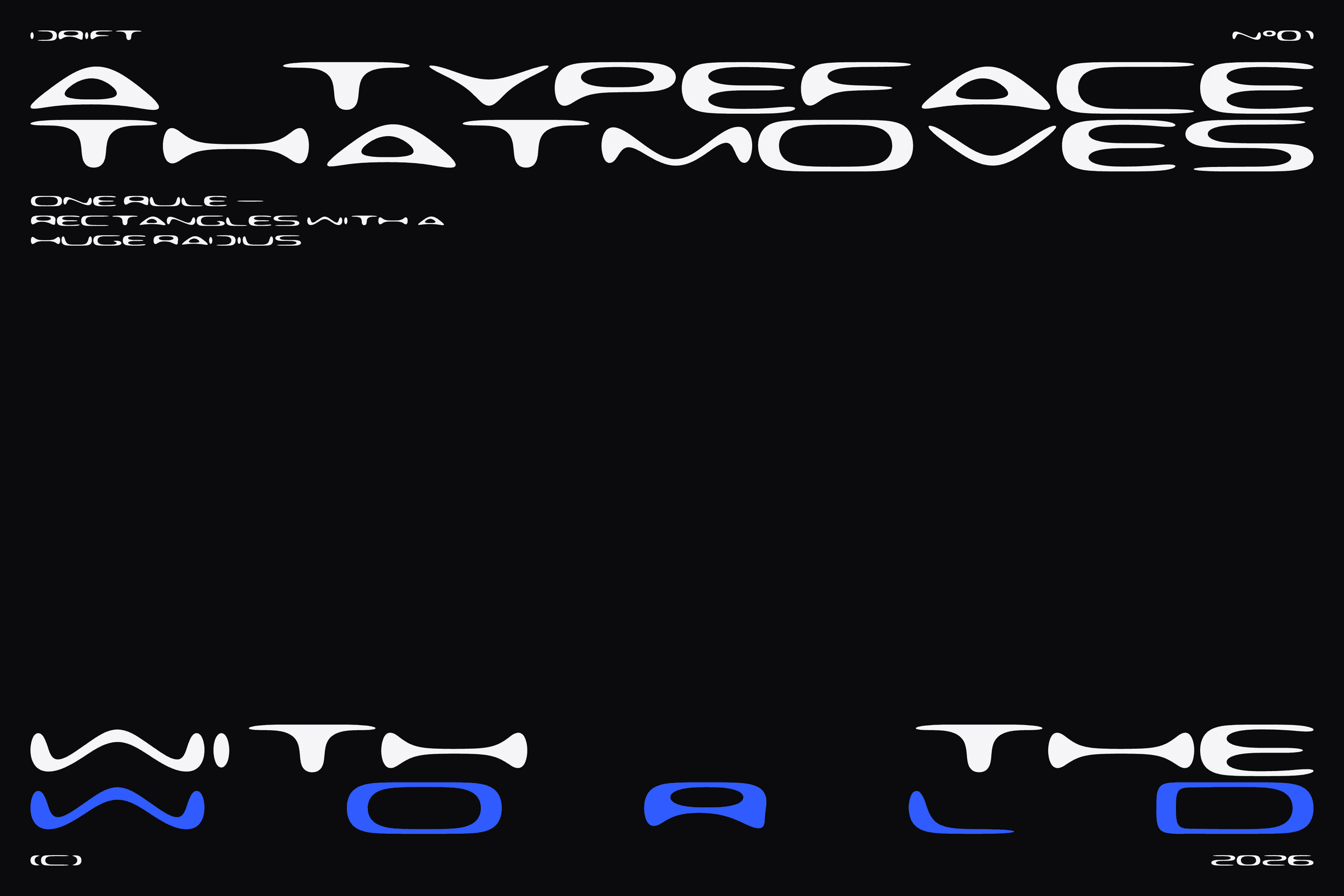
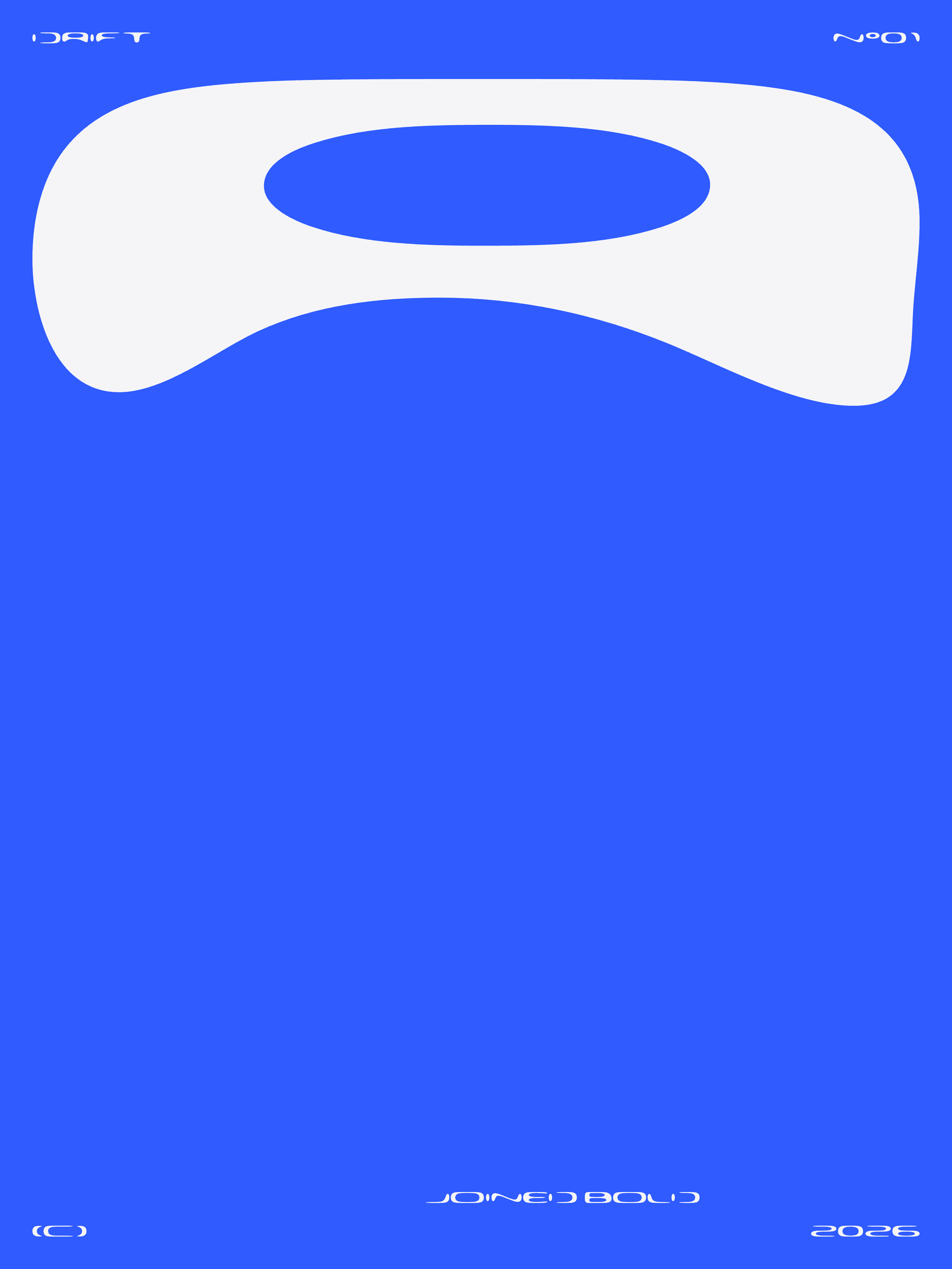
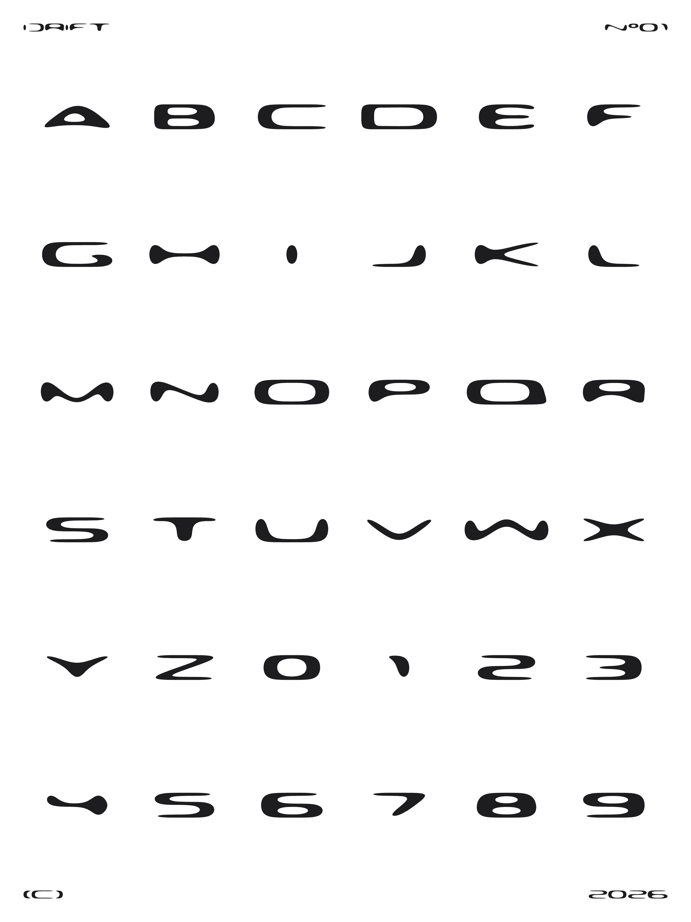
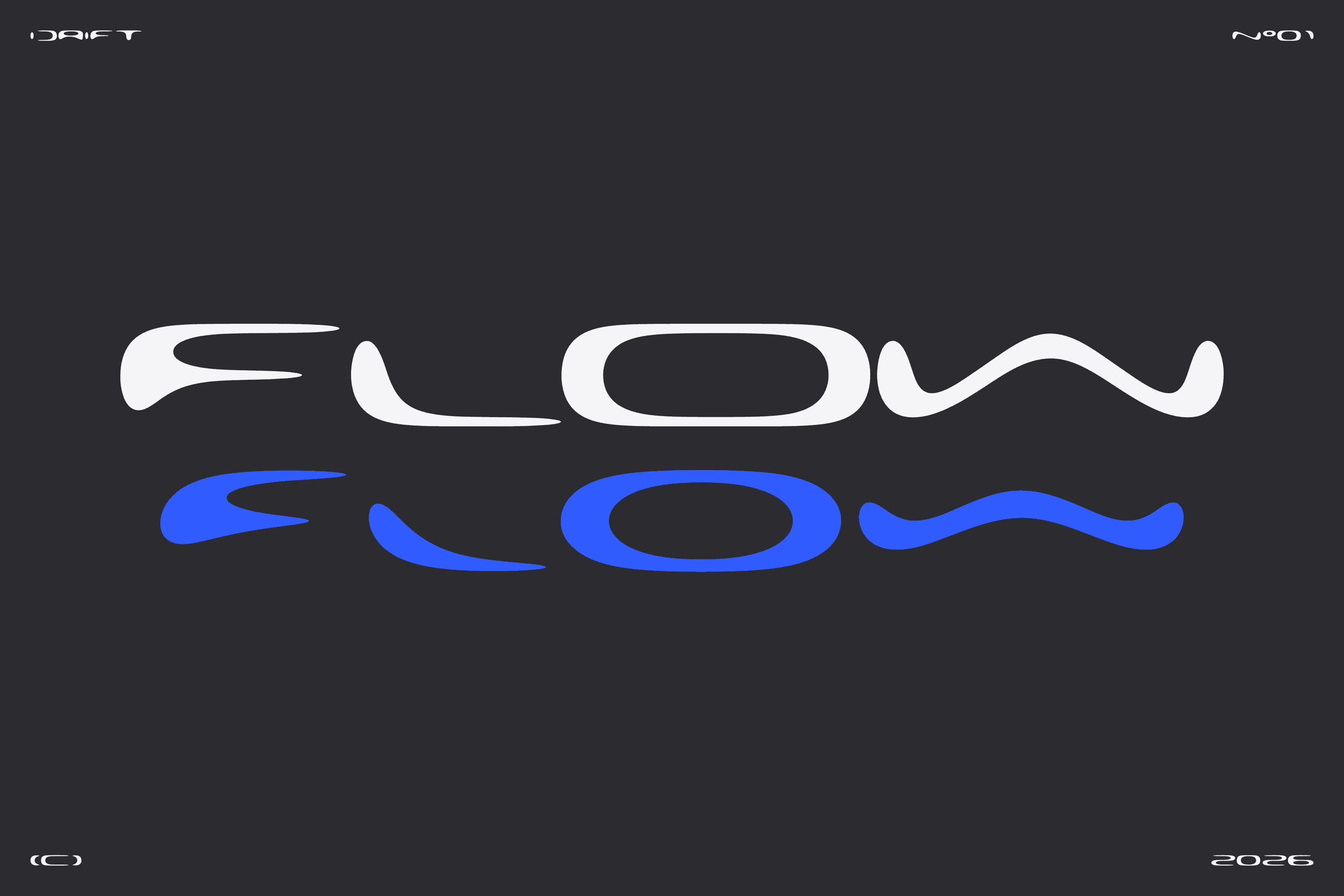
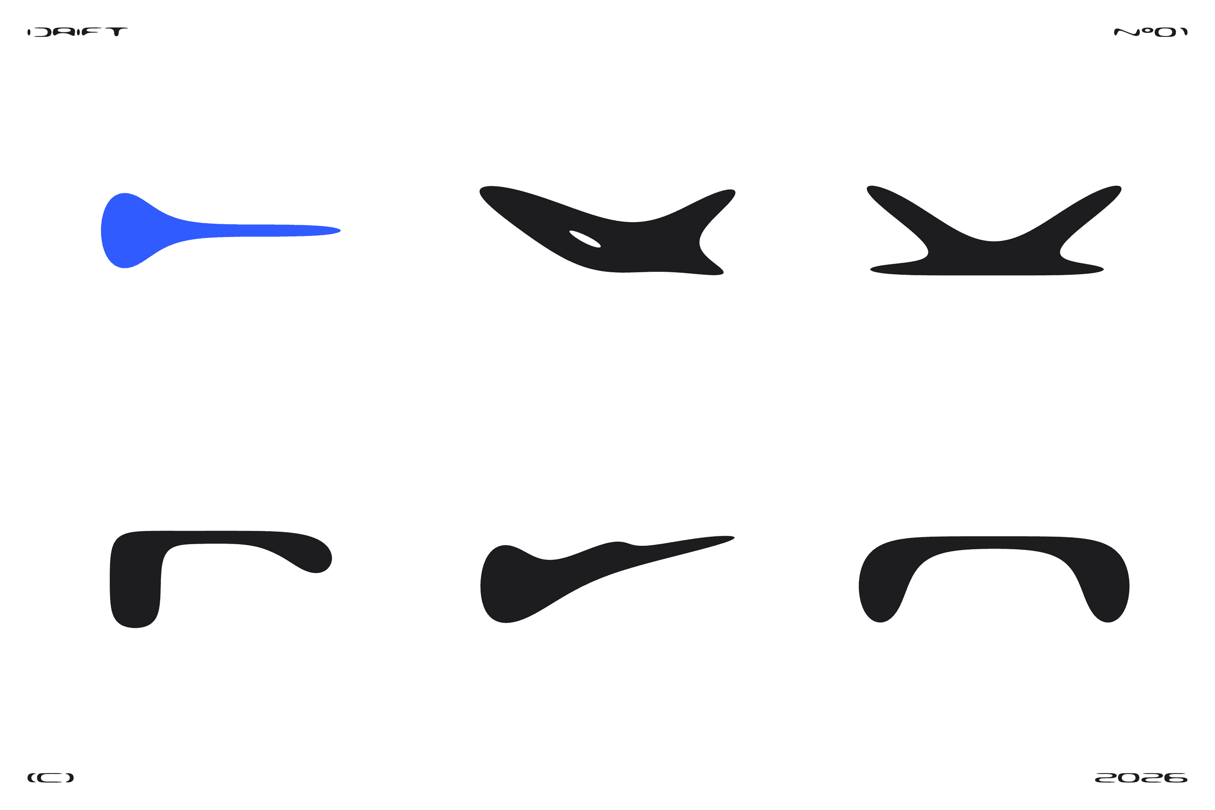
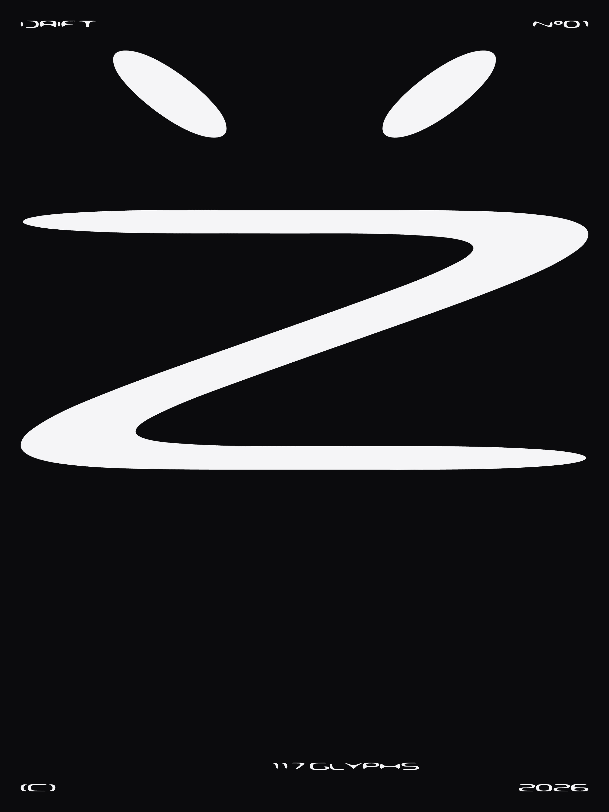
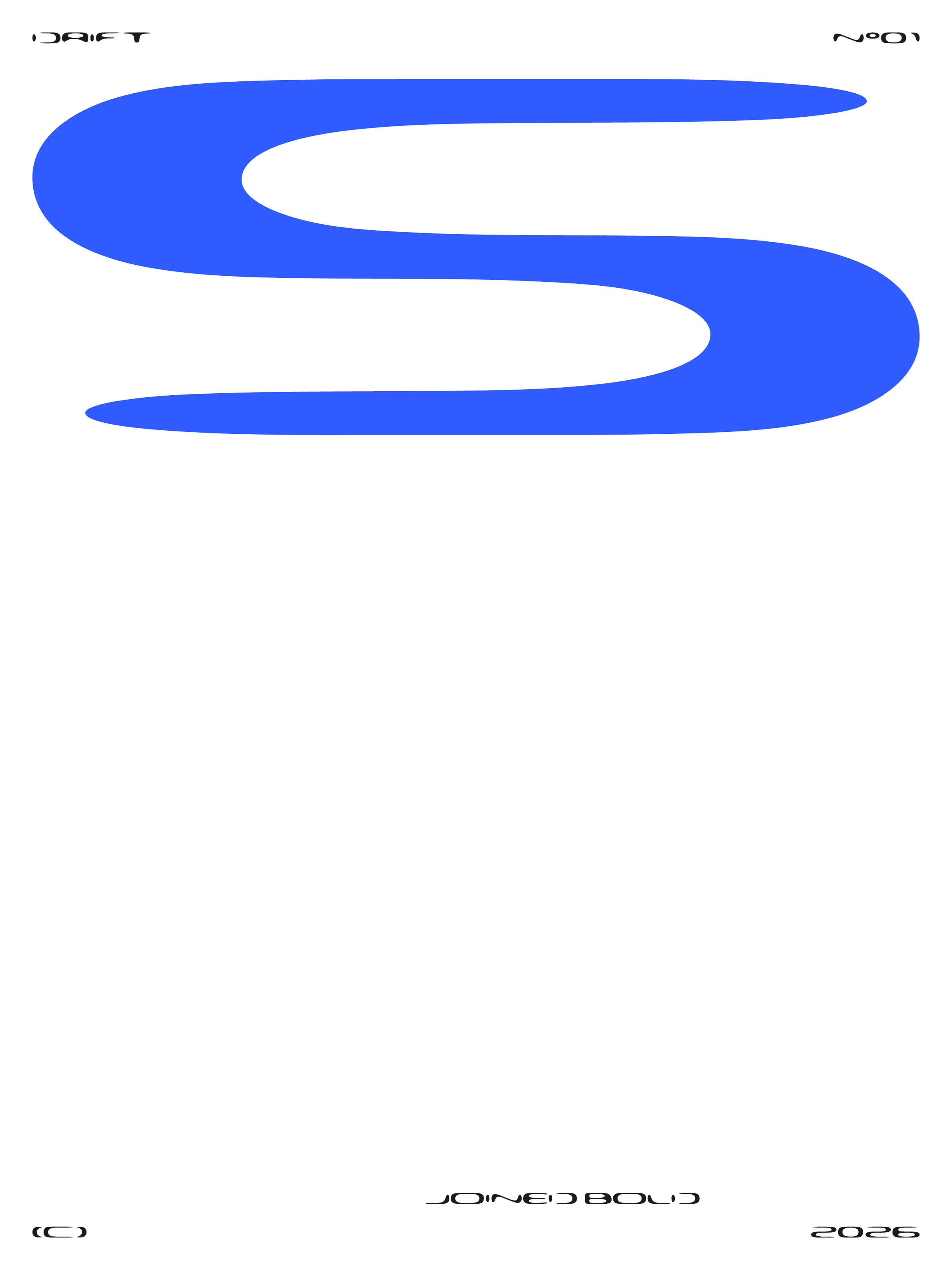
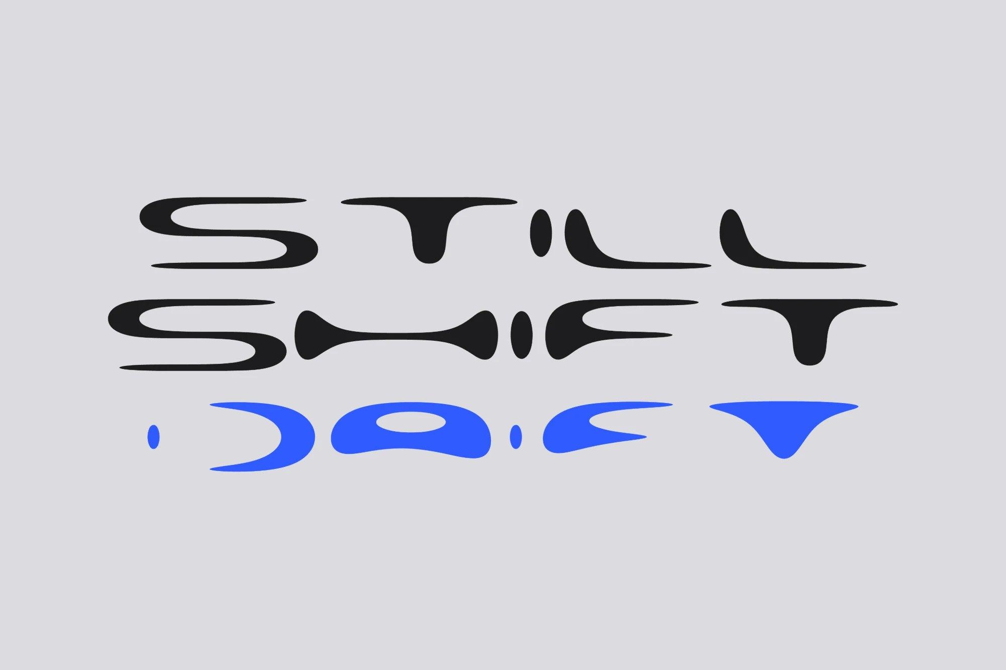
Drift is built from one rule: rectangles with a huge radius. Every letter is a few of them, joined into one shape and smoothed by a single Flow axis — from a strict modular Rect, through Regular, to Liquid, where the letters start to melt. Joined closes the stencil cuts, so the D becomes one continuous stroke; Joined Bold is the loud version for the brand mark and headlines.
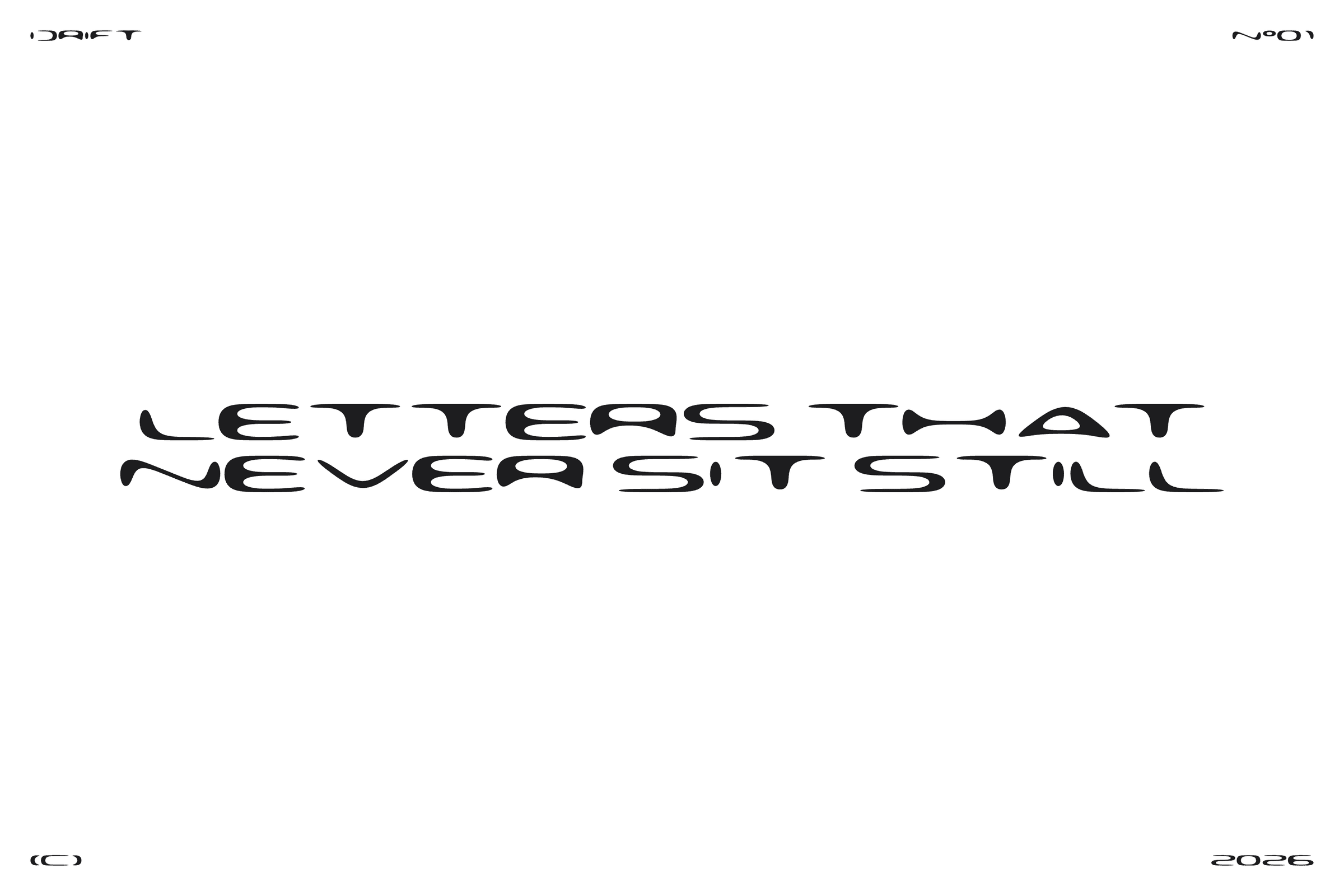
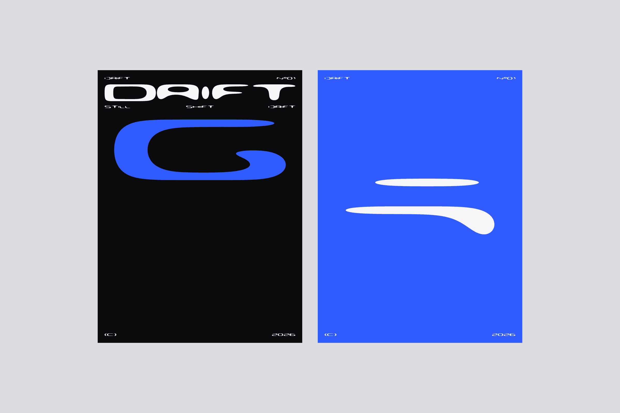
Because the same engine draws the font and animates it, Drift is not only a typeface. It sets a wordmark, a poster, a social post or a motion reel, and every letter can melt into the next. Weight, width, height, flow, join, slant and bar thickness are all axes, so one family covers everything from a quiet caption to a liquid headline.
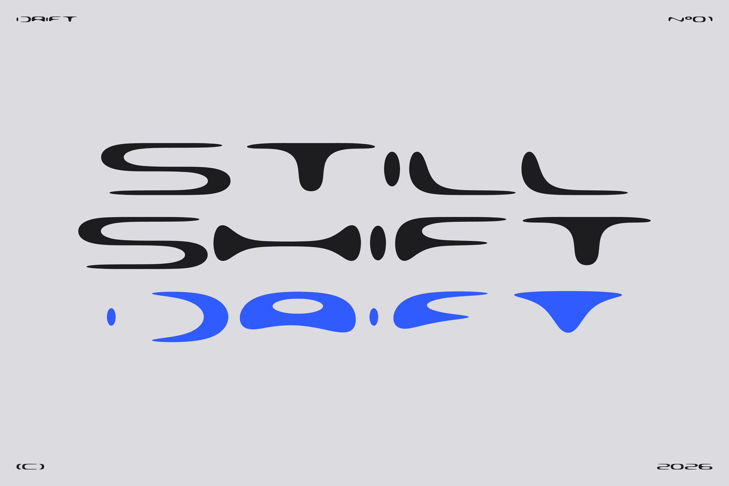
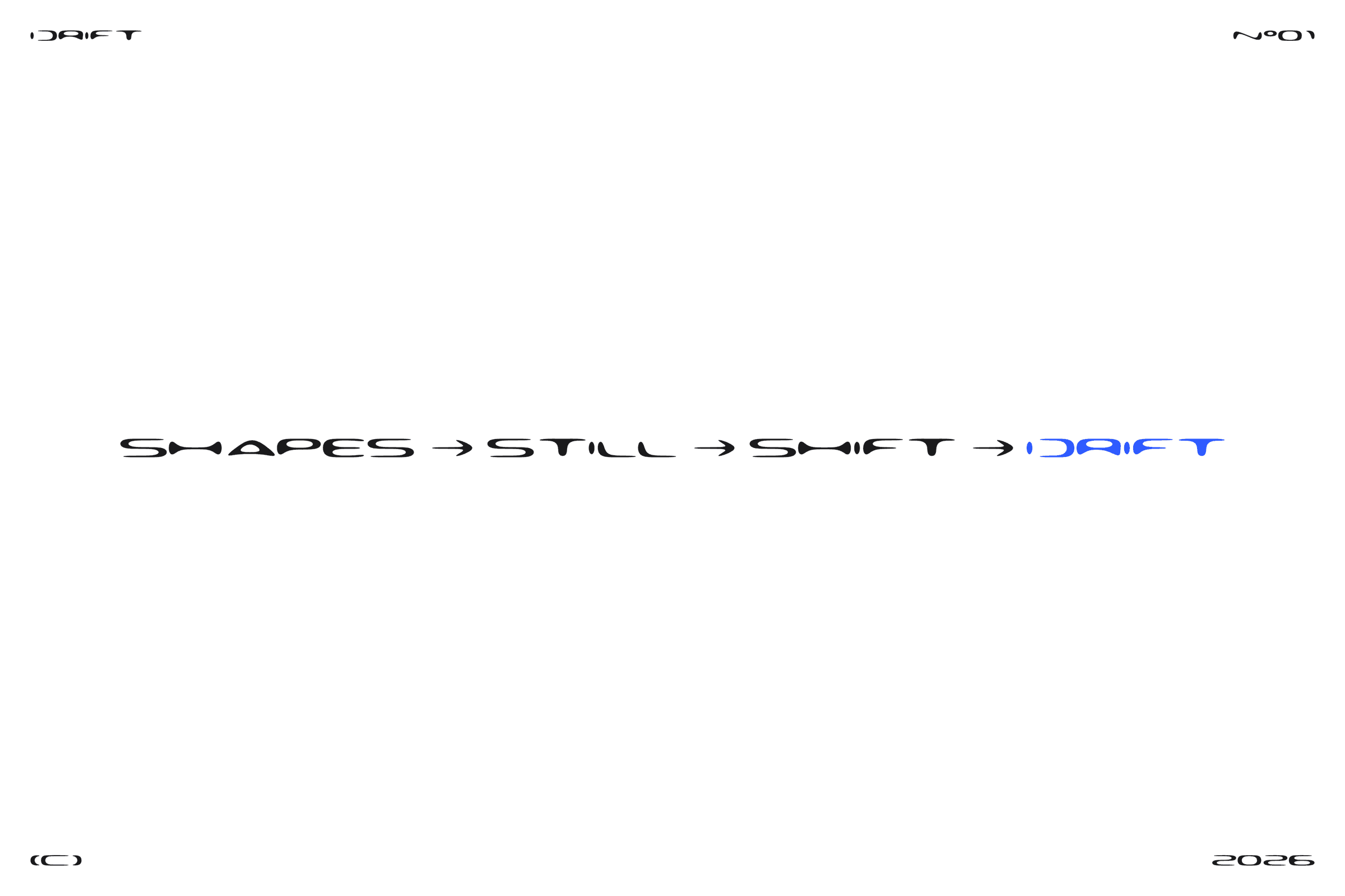
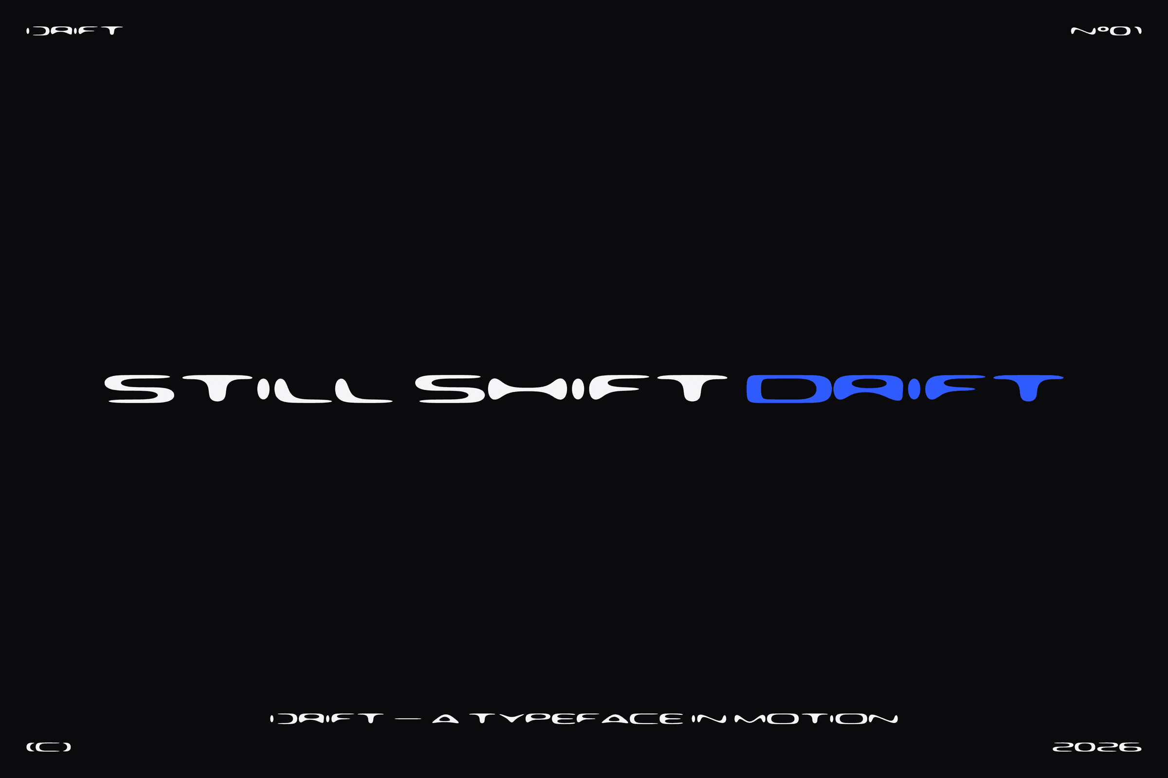
That is how I work as a designer: structure first, then movement. Still. Shift. Drift.
Designed by Tom Naute. Four styles: Regular, Joined, Joined Bold, Liquid. 117 glyphs, Czech and German accents.
- Typeface Brand Motion
DRIFT
DRIFT — Built to drift. A brand typeface that never stands still.
The world my work lives in changes every year — new screens, new tools, new ways a brand has to show up. I wanted a typeface for my own brand that behaves the same way: a clear system underneath, and the freedom to bend when the context changes.
Drift is built from one rule: rectangles with a huge radius. Every letter is a few of them, joined into one shape and smoothed by a single Flow axis — from a strict modular Rect, through Regular, to Liquid, where the letters start to melt. Joined closes the stencil cuts, so the D becomes one continuous stroke; Joined Bold is the loud version for the brand mark and headlines.
Because the same engine draws the font and animates it, Drift is not only a typeface. It sets a wordmark, a poster, a social post or a motion reel, and every letter can melt into the next. Weight, width, height, flow, join, slant and bar thickness are all axes, so one family covers everything from a quiet caption to a liquid headline.
That is how I work as a designer: structure first, then movement. Still. Shift. Drift.
Designed by Tom Naute. Four styles: Regular, Joined, Joined Bold, Liquid. 117 glyphs, Czech and German accents.
- Services
- Typeface Brand Motion
- Date
- Nov 2026